Project Task
Create a design system that is reusable, flexible, and adaptive with accessibility at its core in order to maintain UI consistency and UX patterns across products and teams in order to create a dynamic experience for the user.
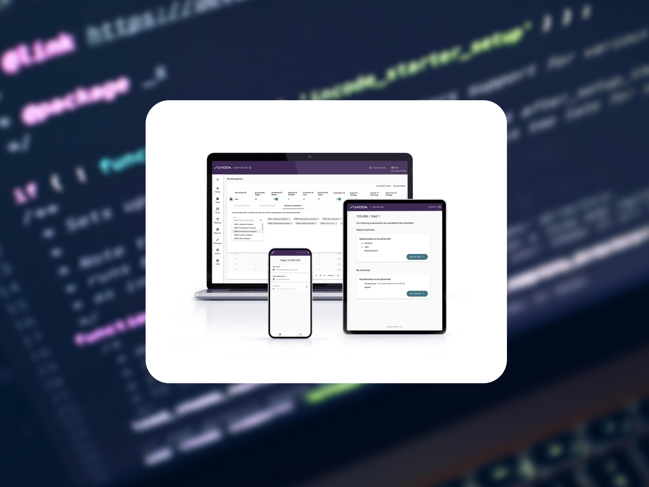
Company: Suvoda, a global clinical trail technology company
Timeline: 2020 (6 months for release v2020.1)
Timeline: 2020 (6 months for release v2020.1)
Team: Project Manager, UX Designer, Design/Dev Manager, Engineering Team
Role: UX Designer
Tools Used: Figma, Storybook, Atomic Design Framework
Role: UX Designer
Tools Used: Figma, Storybook, Atomic Design Framework
Challenges
In the creation of future apps, we knew there were many challenges to solve:
1. Not having a design system (as showcased by inconsistent layouts).
2. Immense person hours needed to create new apps.
3. Resistance to change from already established norms.
Goals
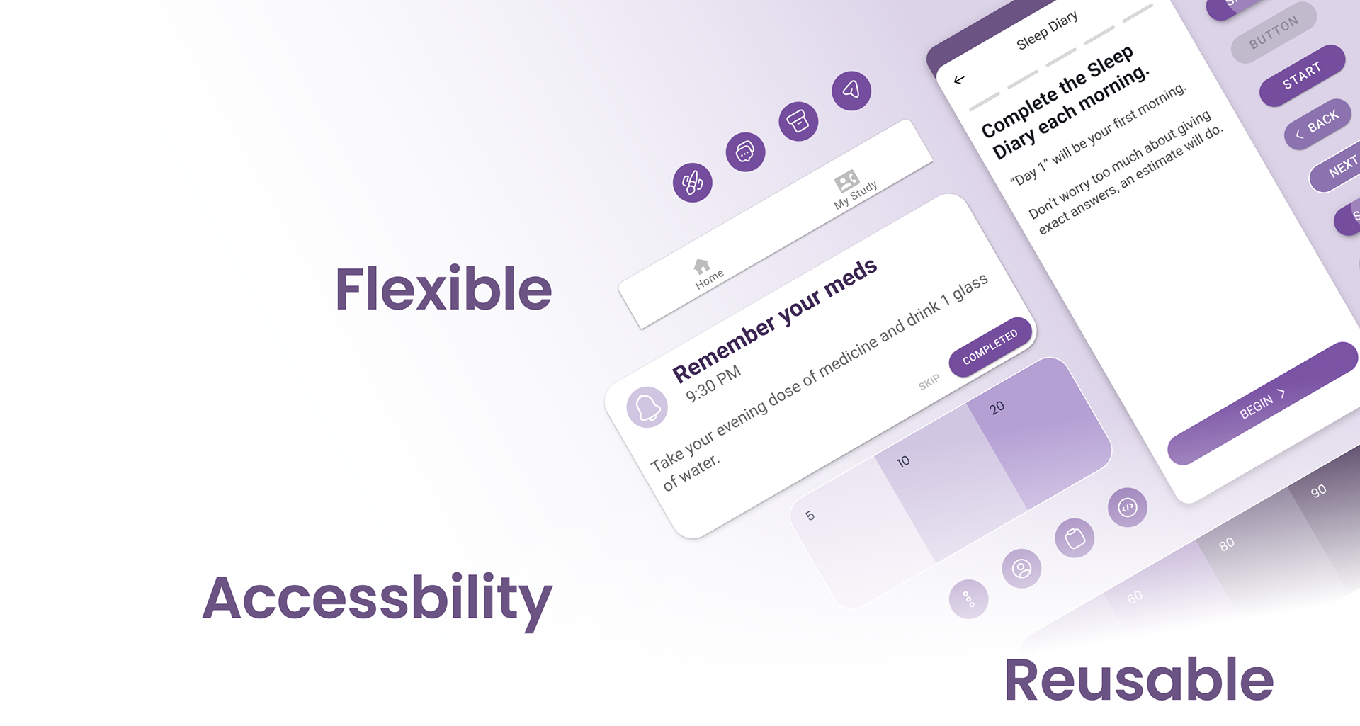
User goal: accessibility, rich dynamic experience
Engineering and Design goal: consistency, reusability system
Business goal: quicker time to market
Design Principles
1. Accessibility: perceivable, operable, understandable, and robust
Color contrast needs to pass WCAG 2.1 Level AA criteria.
Content needs to be display prominently to the users.
2. Flexible and Reusable: creative building blocks to build adaptive layouts and create a dynamic experience
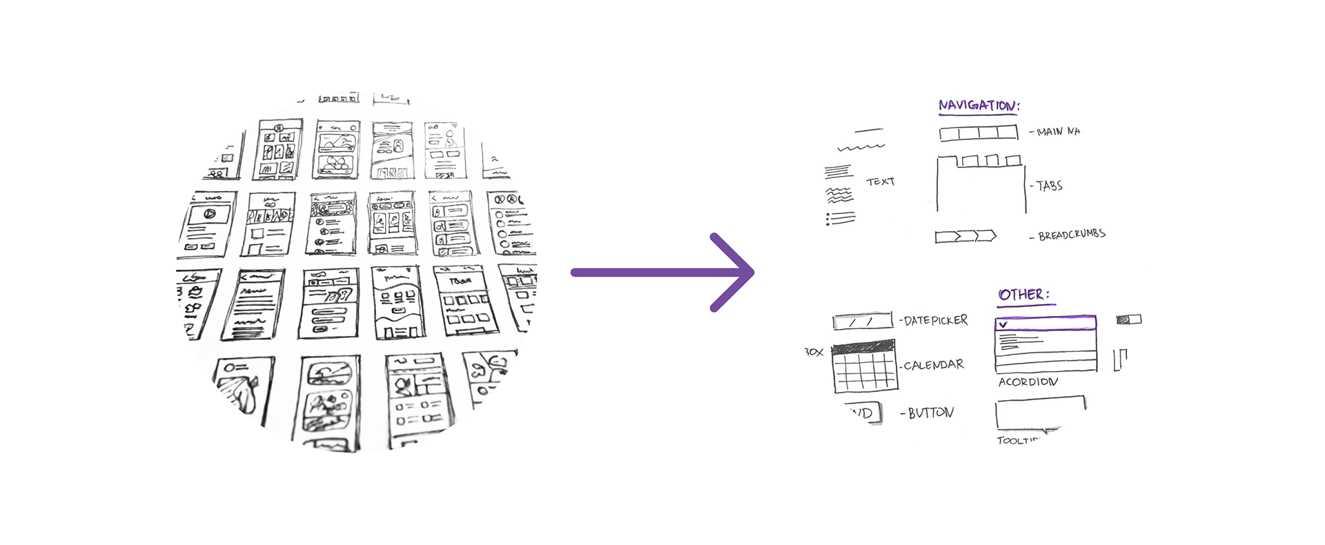
Research
I researched various design systems and decided to leverage Material Design as the foundation and then I created a uniquely branded UI customization on top of that foundation to carry the Suvoda brand and enhanced Accessibility elements.
The development team utilized a React tech stack and also Storybook which is a frontend workshop for building UI components and pages in isolation.
Foundation
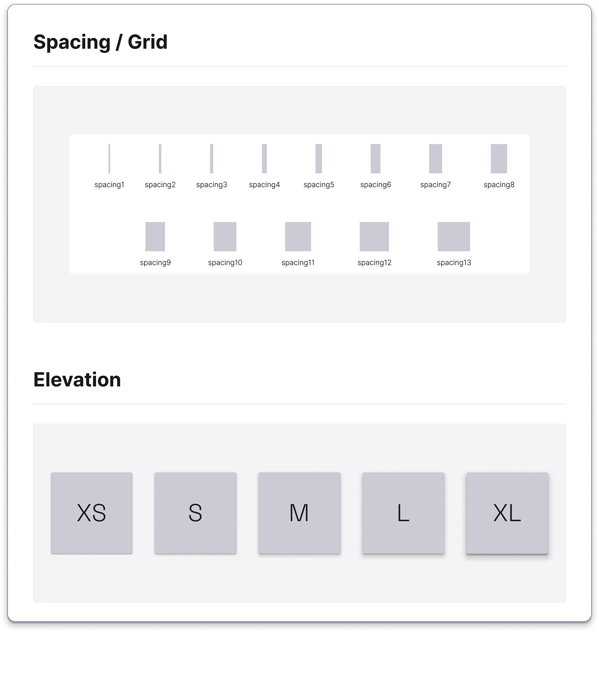
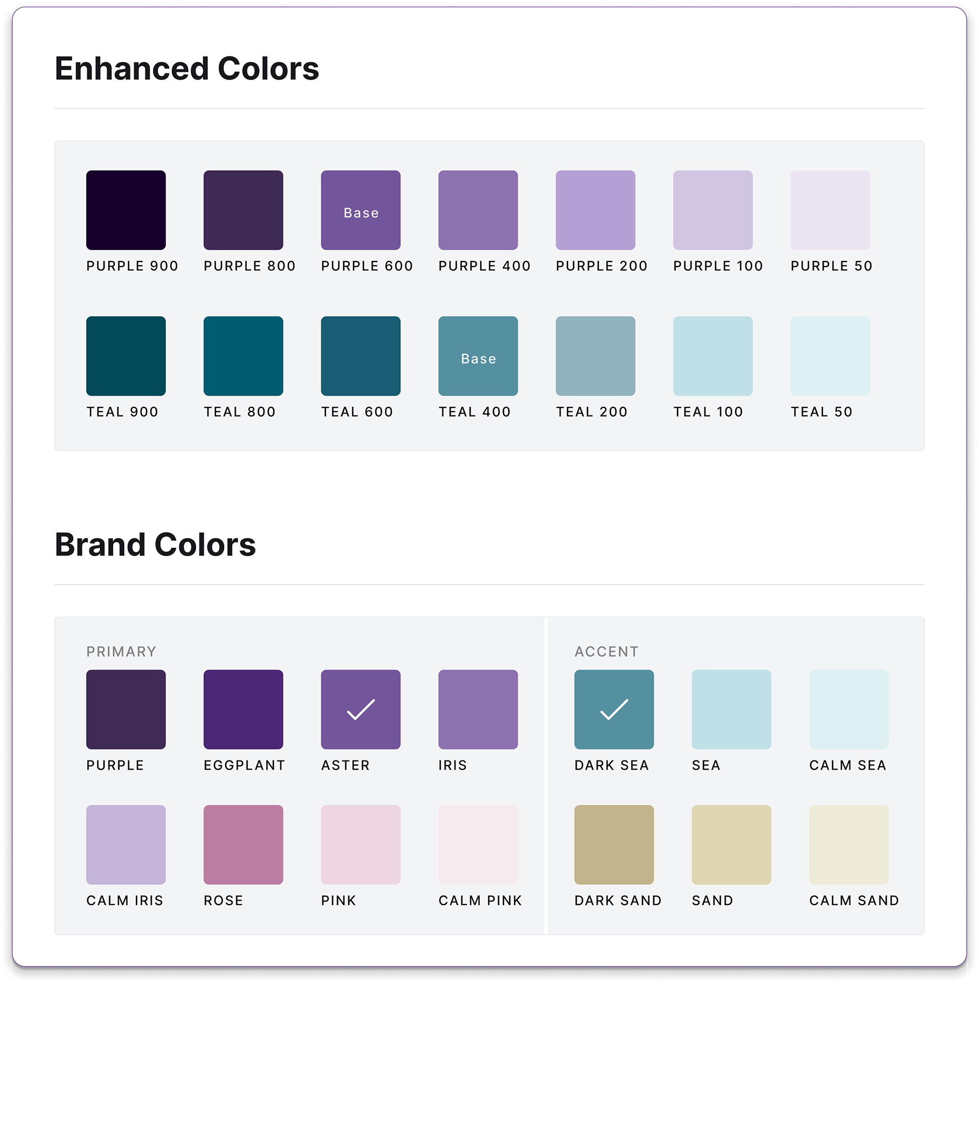
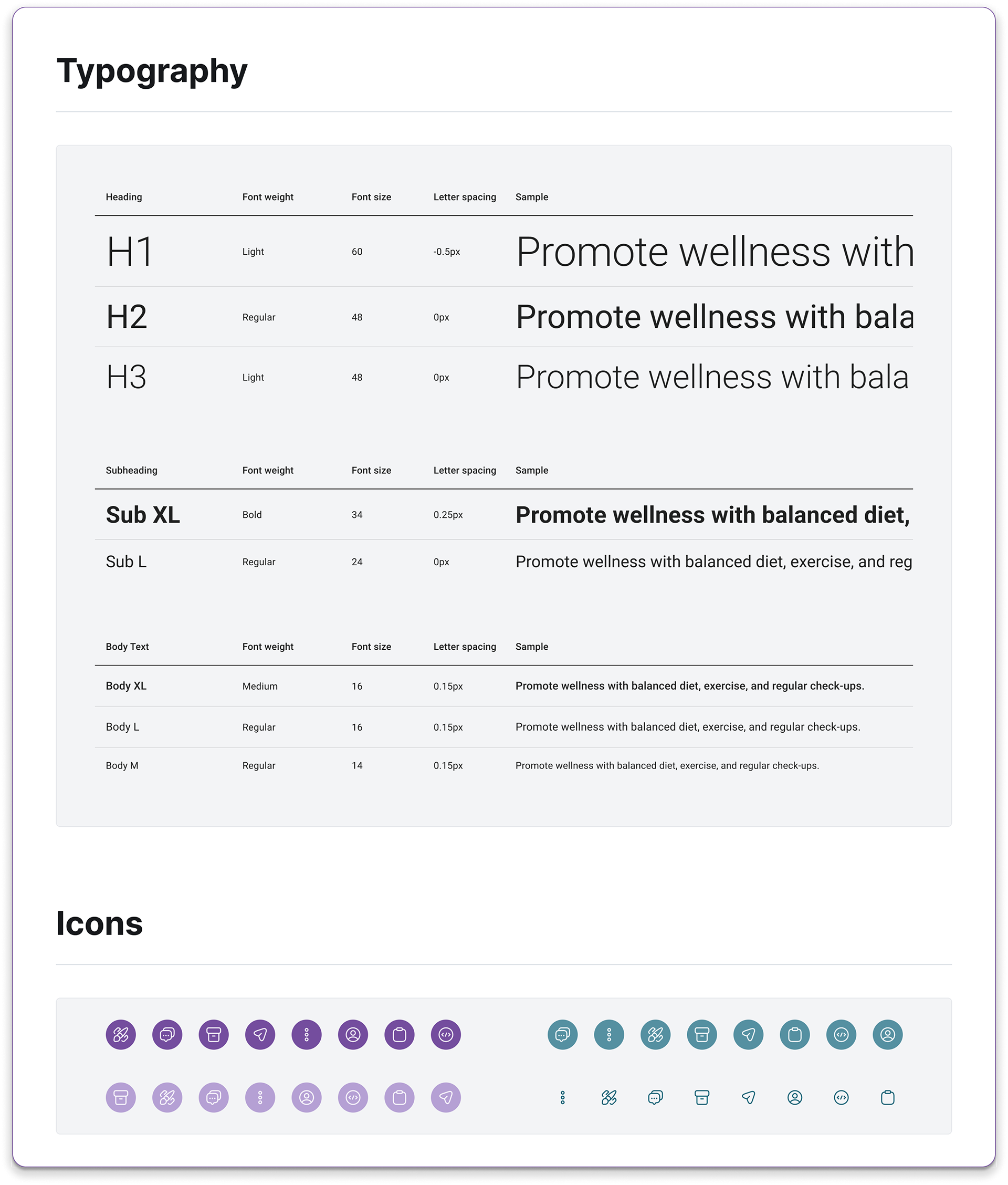
The building blocks of the Flex Design System are: typography, color, and spacing/ layout grid elements.
The typography scale offered a dynamic range for display across all digital experiences. The color palette was enhanced and expanded on the Brand Guide in order to achieve sufficient contrast. The spacing and grid system created an adaptive yet consistent experience across all digital experiences.
I led the created a common, agreed upon language between Project Owners, Engineering Team, and Designers. (For example, a component could have different names such as toast, snackbar, alert message.)
I carried forward this common language into the Figma files in setting libraries, variables, and design tokens.
Components
A well designed component should be flexible enough to account for the various instances needed, but in a consistent and understand manner.
I prioritized the components needed for common work flows, such as buttons, text, selector inputs, snackbars, chips, cards, and tables.


Templates and Screens
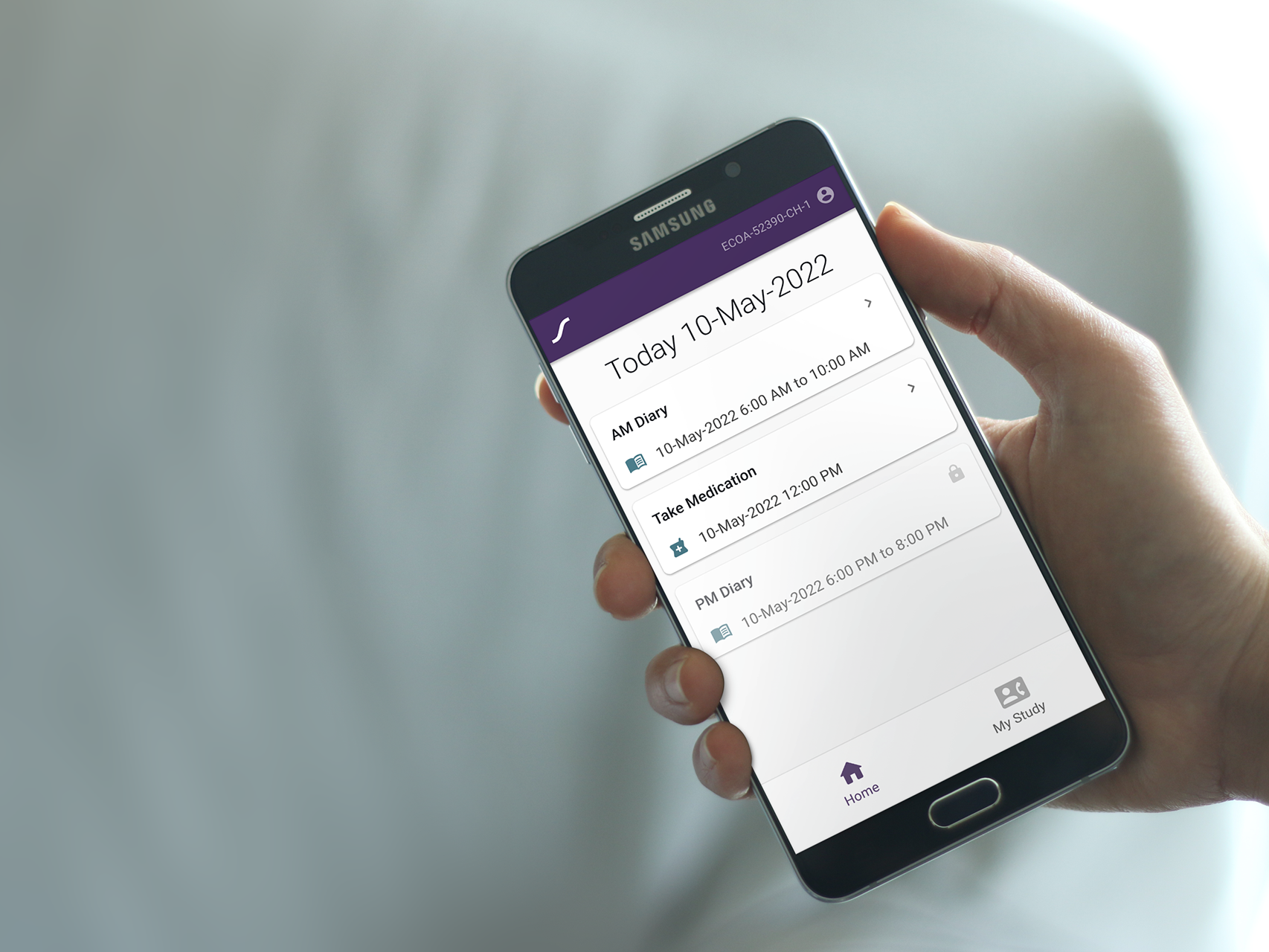
In creating templates, it allows for consistence from screen to screen as well as reusability which was very important for the team as there was an unknown number of screens needed.
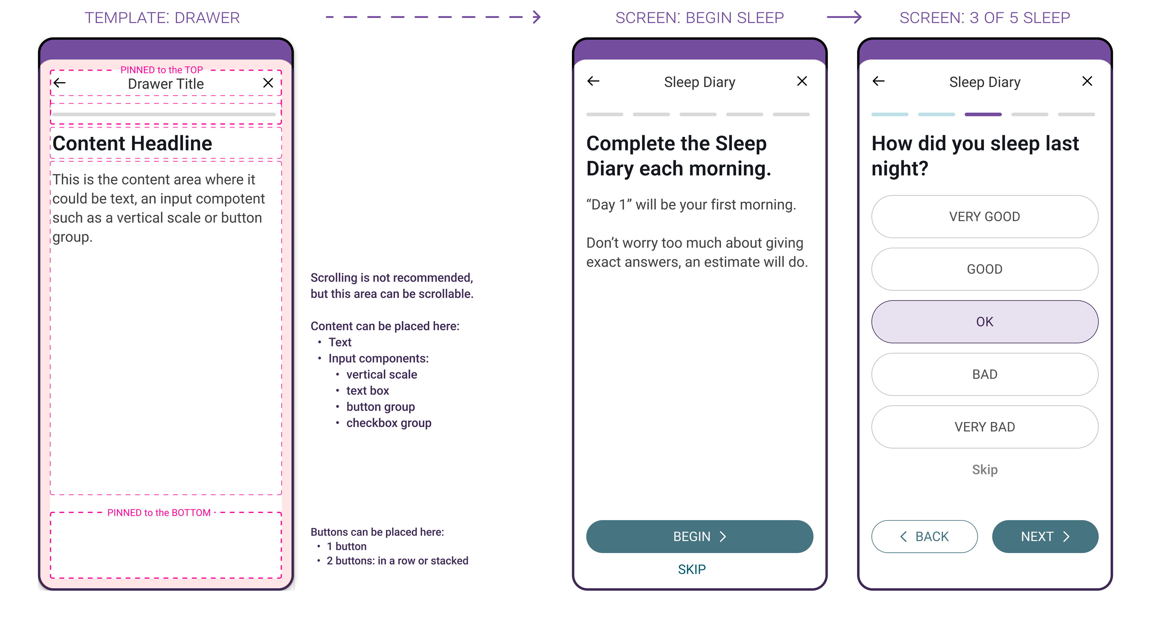
Drawer Template used on the "Begin Sleep" screen and the "3 of 5 Sleep" screen.
Documentation
Design documentation played a vital role in the wider success of launching new apps by facilitating communication, maintaining consistency, and providing clarity between UX designers and developers.
This design documentation was especially important as all the team was remote and worked across time zones and continents (7 hours working different was typical). The documentation helped in so many ways with clarity of vision, communication and collaboration, consistency, future reference, onboarding new team members, and development handoff.
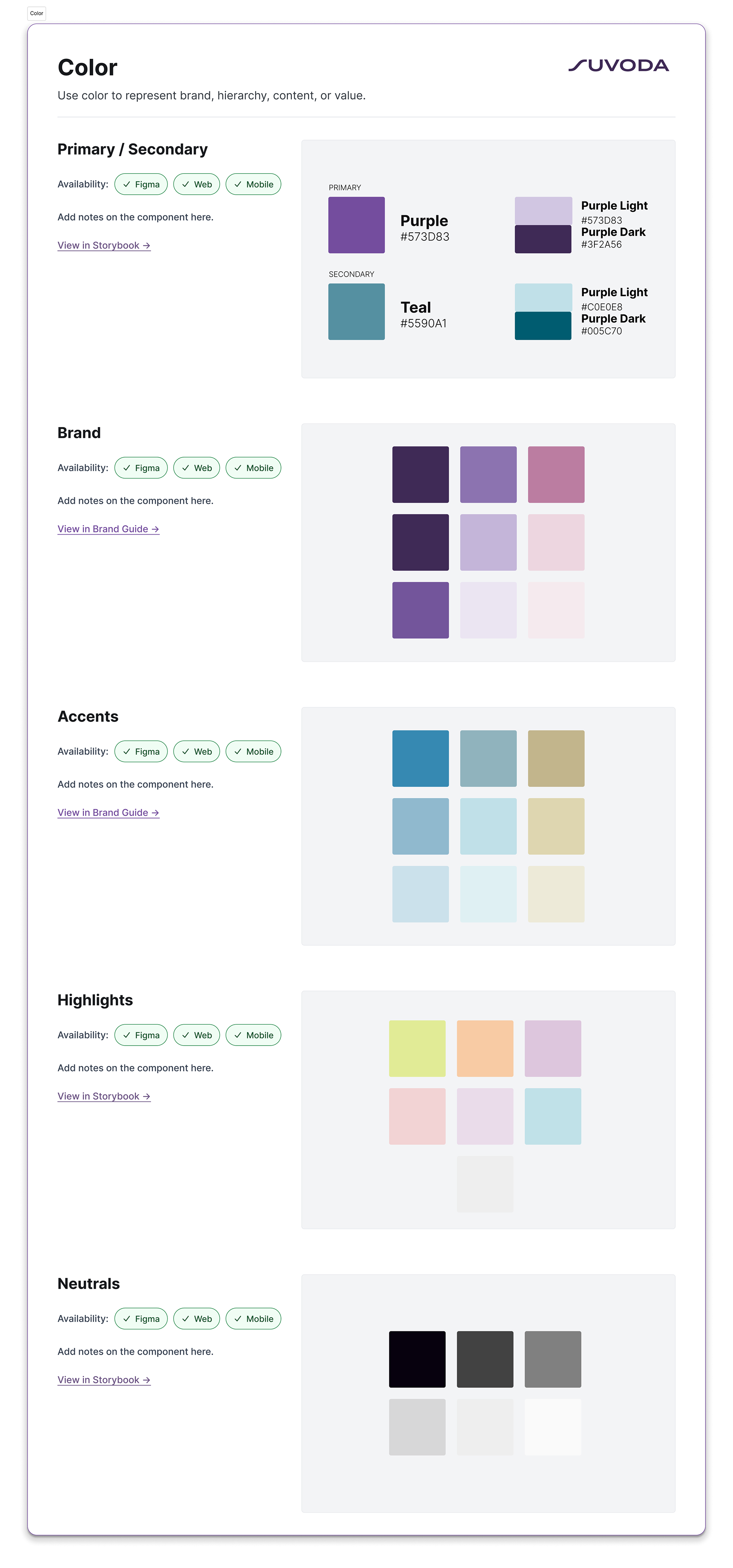
Color Documentation
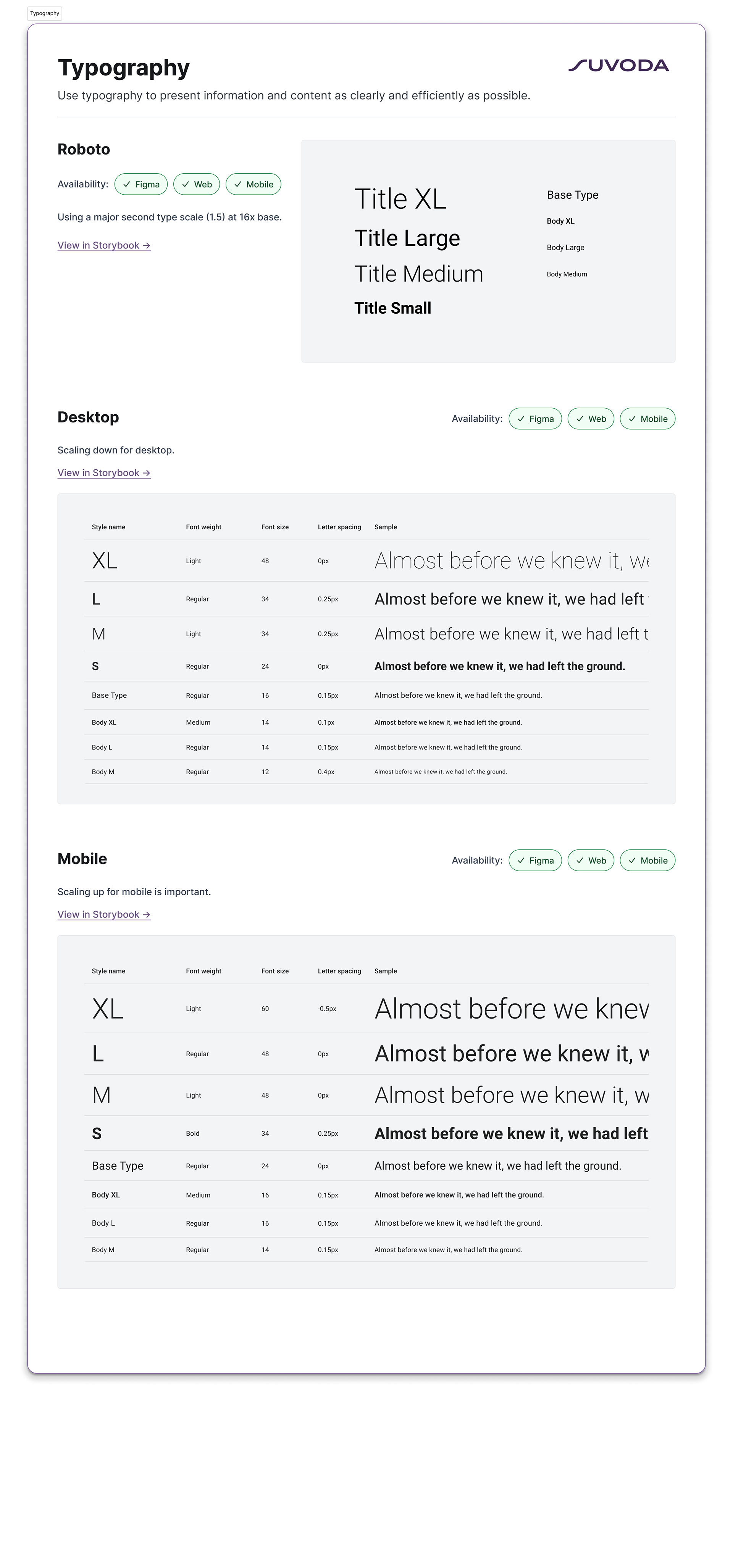
Typography Documentation
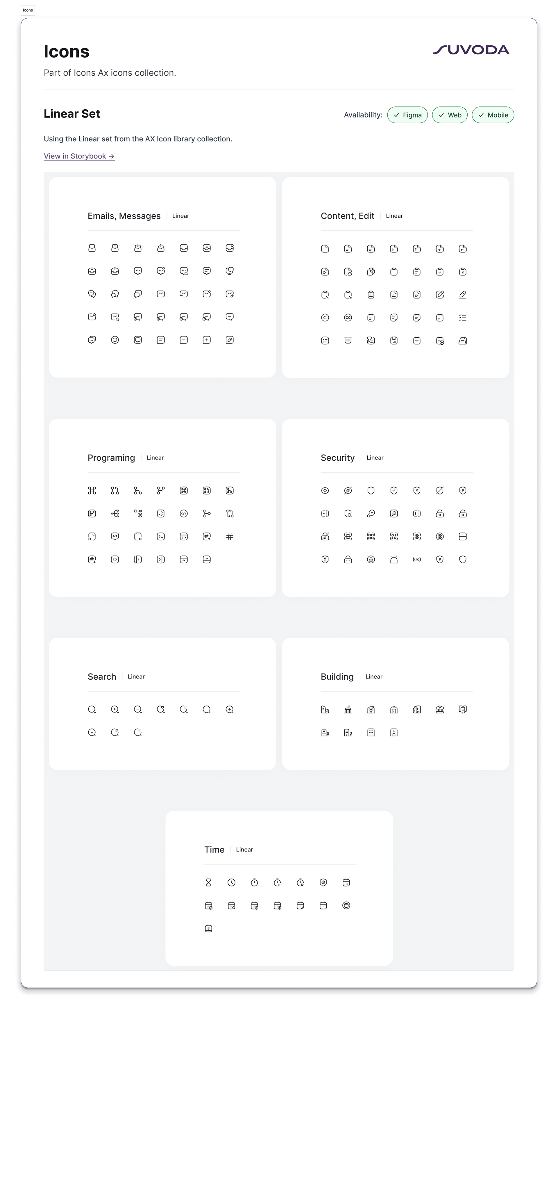
Icon Documentation
Iterate
Before the first release was finalized, I worked with the Project Manager to plan for the future releases. We received feedback from designers and found gaps in the design system. Then we looked at the Engineering Team's work capacity and we prioritized enhancements and new elements per release.
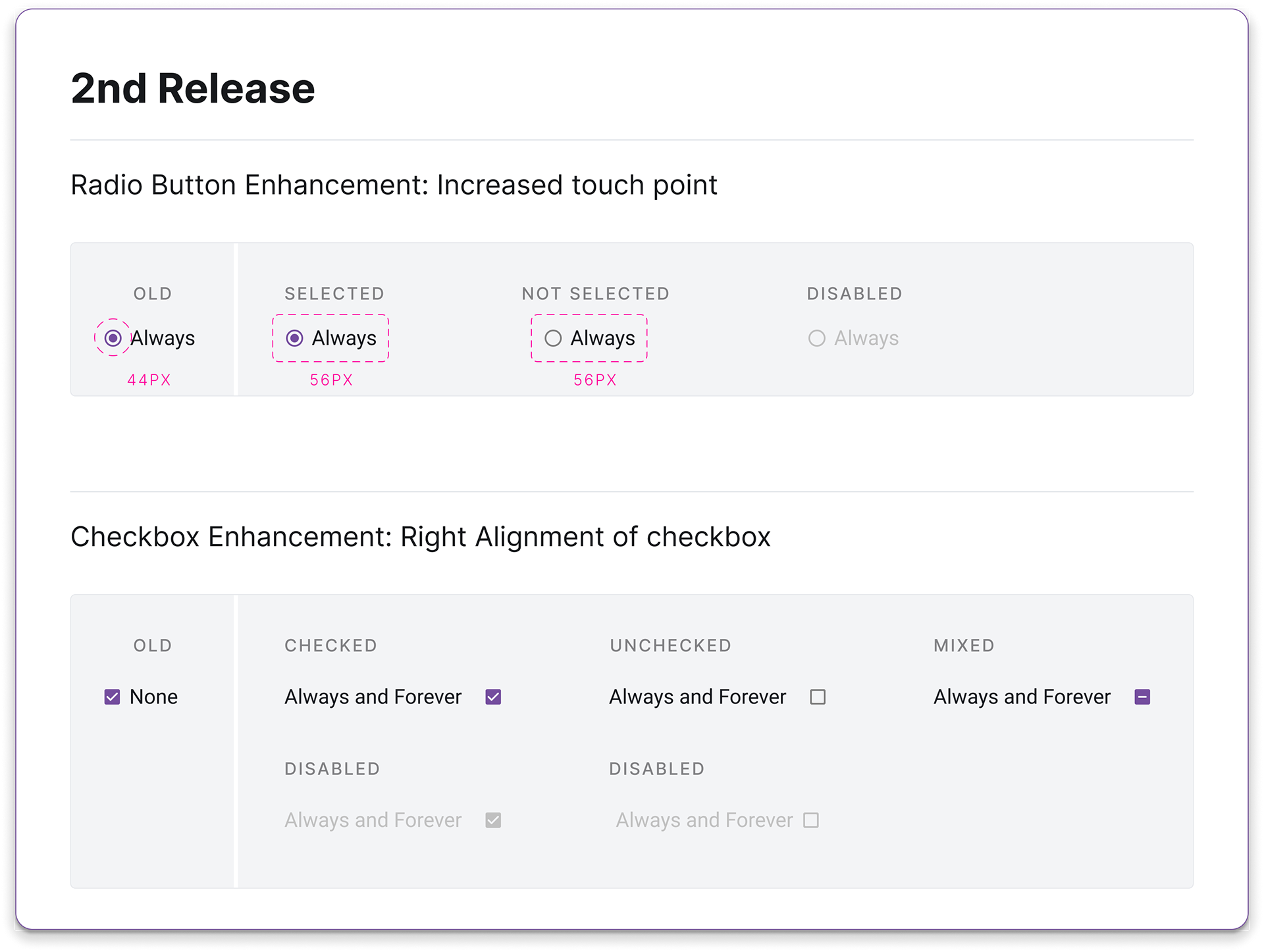
2nd Release
- Radio button group enhancement to increase the touch target
- Checkbox group enhancements to allow for the checkbox on the right

3rd Release
- New Dark Mode
- Data table enhancement with same features but lighter codebase (not shown)
Backlog
I kept a backlog of feedback that helped inform how to prioritize the component for a future release.
- New progress step component
- New scale component for common questionnaire
- Enhancement date picker because touch points aren't obvious
- Enhancement time picker to add 24 hour mode
- Enhancement time picker because the clock face dial is confusing
Team Success
I made sure the naming of tokens and components were agreed upon by all parties involved (PM, PO, Devs, UX).
This design system was created with the goal to future-proof the potential growth of the design system with specific naming and flexible organization to accommodate any new additions.
The Flex Design System had to be well maintained across Figma, dev repository, and Storybook. In order to make this possible, a new role was added to our team as Design System Manager who owned both front-end implementation in Storybook and the repositories. She expertly managed our unified language between developers and designers to ease the “design-handoff” pitfalls of lack of understanding the others lingo and needs.
We reduced stress and sped up the end-to-end experience of getting new products to market.
Results and Impact
From the Flex Design System, Suvoda released 4 new apps to their Product Suite and received high marks in a patient usability study by RWS.


