Contract via eCity Interactive
Information Architecture & UX Design
Year: 2022
Project: B2C | Youth Organization | Website | Non-profit
Role: User Researcher | Information Architect
Design Process:
User Research - UX Audit | Persona Building | User Stories | Stakeholder Interviews
Information Architect - Information Architecture | Sitemap | User Flow
Description
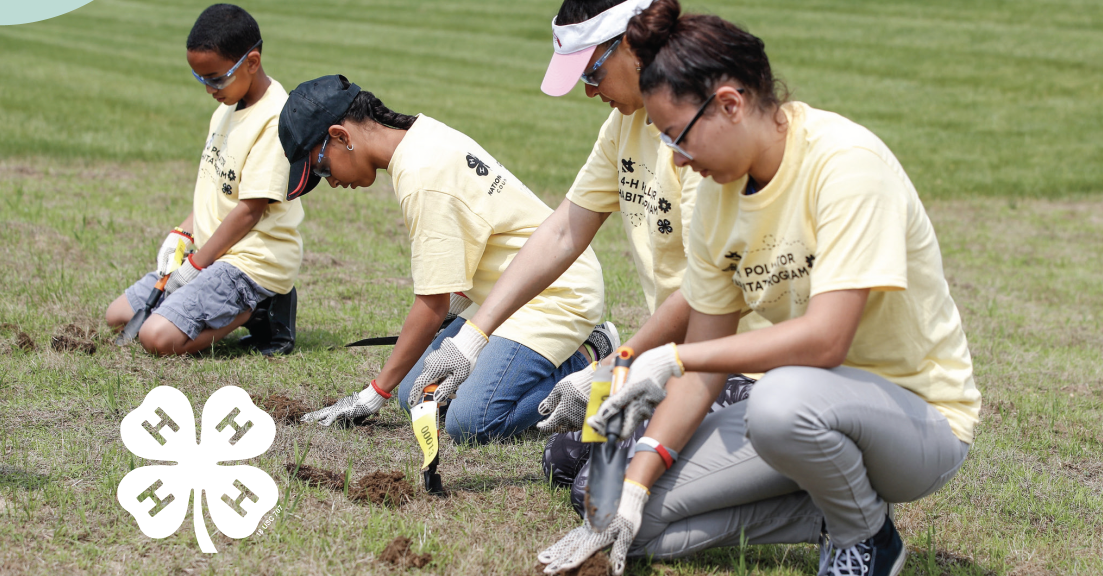
During a complete rebrand for 4-H Council, a youth focused nonprofit, I provided UX guidance and recommendation for site navigation structures with an aim to better resonate with their audience, enhance engagement via their digital online curriculum, and support the digital transformation of 4-H: Clover (formerly 4-H At Home) in the site navigation.
eCity Interactive contracted me as a UX Designer for this project over the course of 2 weeks.
Background
The National 4-H Council aimed to redefine its online presence during a strategic rebrand and site reorg. The multifaceted goals included resonating with diverse audiences, extending support to STEM and wellness, not just agriculture, and enhancing engagement across digital and in-person platforms.
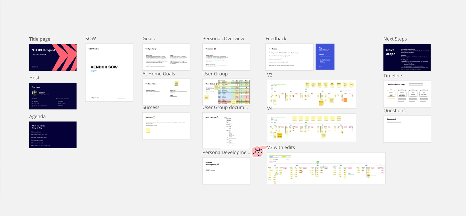
My Process
After reviewing their 2 proposed site navigation structures as a fresh set of eyes, I provided feedback and guidance on the options.
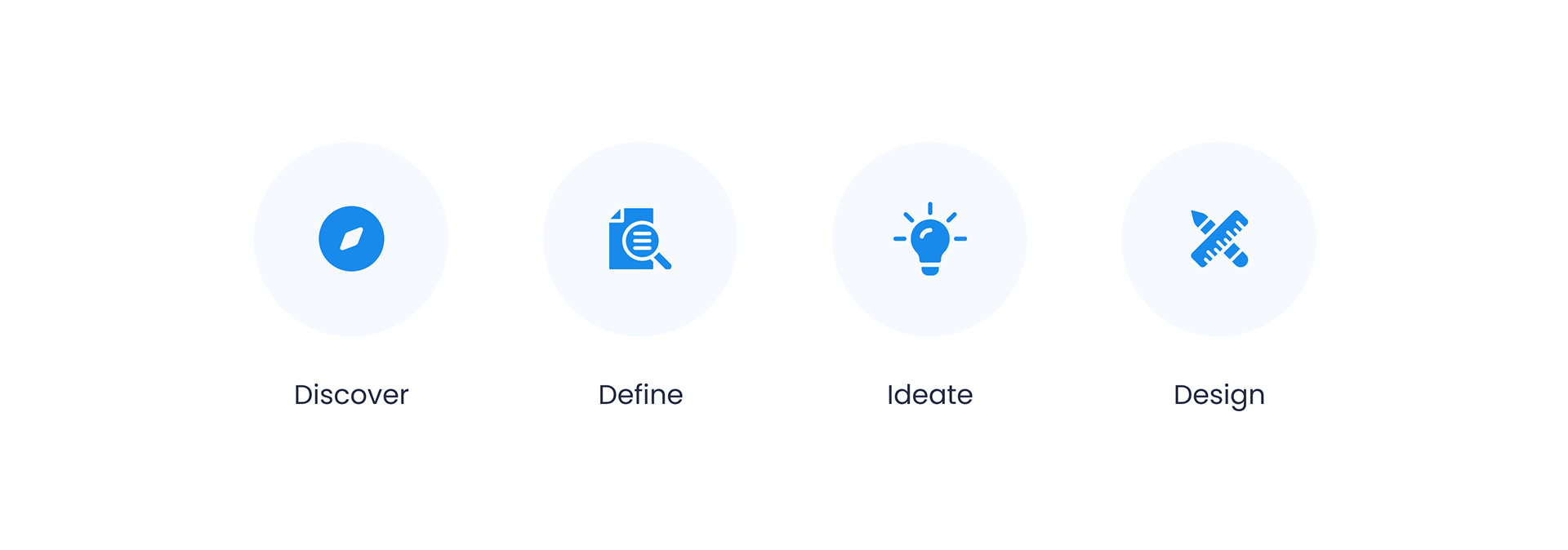
Discover
After reviewing two proposed site navigation structures, I conducted an audit focusing on keywords such as youth, clover, and caregivers. A workshop utilizing Miro with key stakeholders provided the following crucial insights:
- Median youth is 9 years old.
- The core youth audience ranges from 7-11 years old.
- Youth ages15-18 and 2 sets of caregivers (parents) are important.
Pain Points:
The client desired to pivot to more youth focus in the rebrand but didn't provide the strategy behind the new focus, I therefore had to make some conclusions based on limited research due to a compressed timeline.

One of the proposed navigations
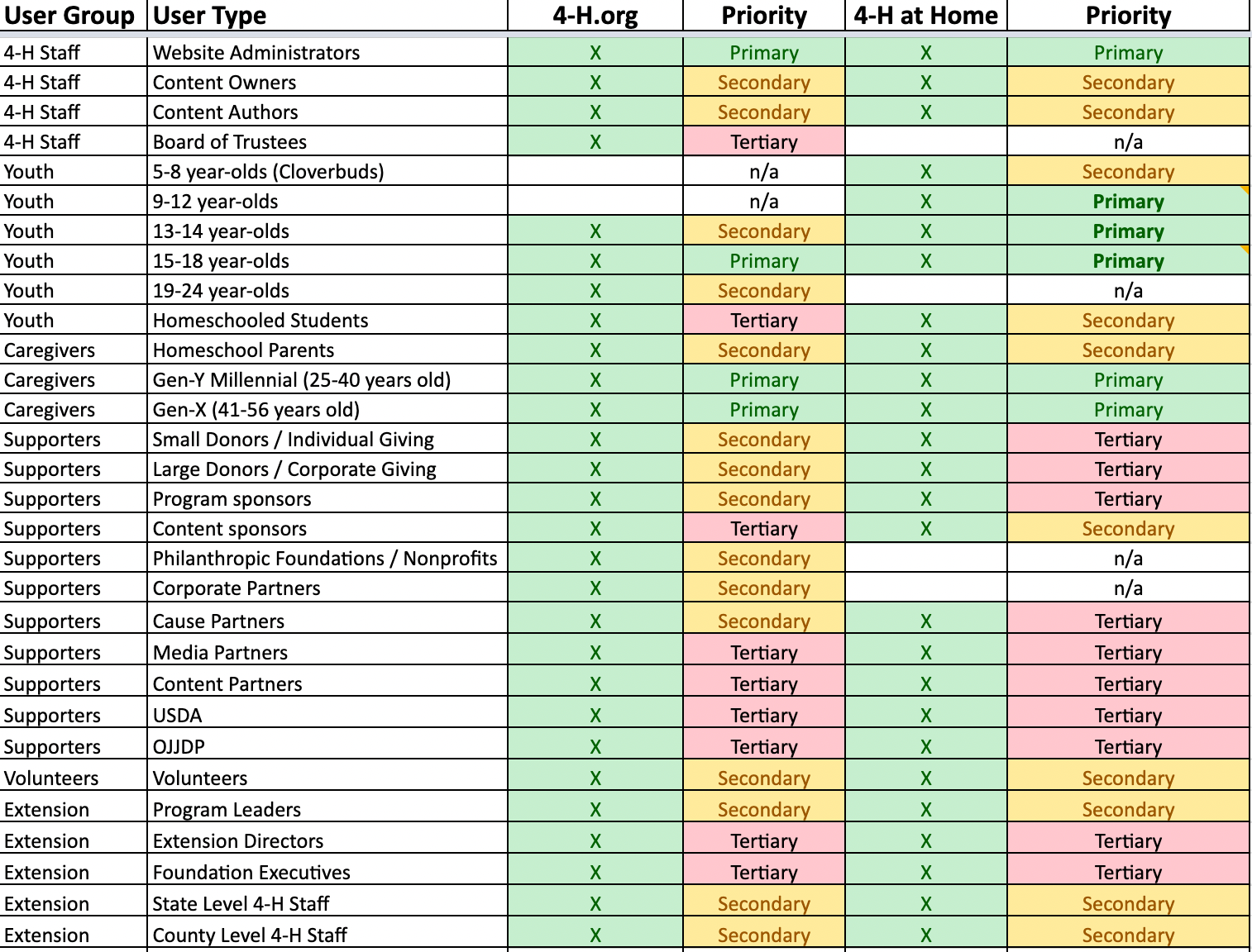
User Group Demographics
Workshop Slidedeck
Define the Problem Statement
The current site architecture lacks clarity, causing users to face navigational challenges and inhibiting their ability to efficiently access relevant information. This issue is exacerbated by the growth of their content and the introduction of new features over time. The current site structure contributes to a decline in user engagement, as users may abandon their journey due to frustration with the navigation experience.
A strategic and user-centric reorganization is necessary to enhance the overall user experience, simplify navigation, and foster meaningful engagement with our content.
The main goal is to focus on findability:
- To align in keywords so as to guide the users where to find specific content
- To help visitors find and reach the content they are looking for
- To enhance user engagement
- Increase the findability for Clover
Ideate
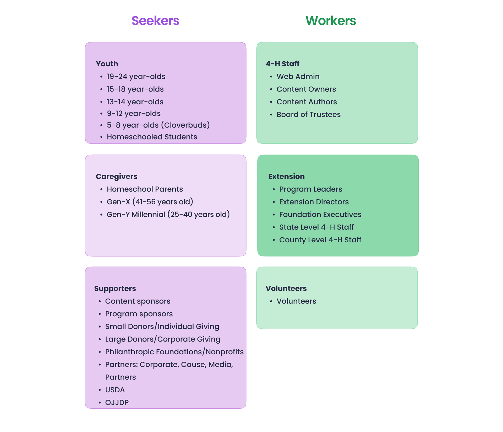
The target user groups for the 4-H council programs consisted of 4-H Staff, Youth, Caregivers, Supporters, Extension Staff, and Volunteers.
While each of them have unique needs, goals and behaviors, for the purpose of this analysis, it made sense to group them in to 2 larger buckets of seekers and workers.
The Seekers are those who came to the website to find programs, experiences, and financial support opportunities. They will be who get marketed to. They might visit the website with curiosity with a clear goal in mind so very clear language and user-centric navigation will be key.
The Workers are those who are likely already connected to 4-H. They will be required to navigate through the site for work demands but once they gain that knowledge, repeat visits might become less necessary
After reviewing the two site navigations with these user groups in mind, it was reinforced to proceed with Option 1.
This navigation offered key land pages with concise, common and clear language for the navigation. By employing stronger messaging in the navigation, we achieved the goals of the youth audience. We improved word choice and frequency to align with a new primary youth audience.
Also, we increased Clover's visibility by featuring it more prominently in the navigation and mentioning it more frequently.
Design and Iteration
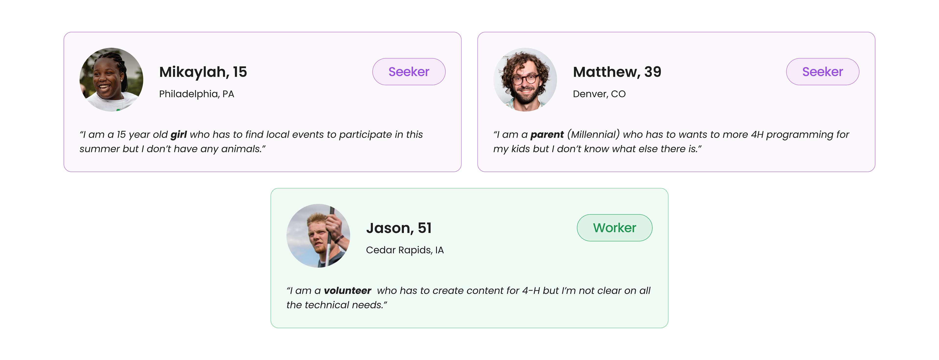
In the initial stages of product discovery, the primary aim for creating personas was to identify the core needs of the target audience and build profiles for users.
These design decisions align with the user needs by creating an intuitive navigation with clear concise language, and it brings alignment of relevant information, and promote the new Clover offerings.
In the initial report, it was noted that in option 1 of the site navigation had more mentions of "youth" across all 3 levels, it offers 4 mentions of Clover, and brings "Caregivers/Parents" to the top page level. Clover is brought in to prominence in the navigation by frequent mentions in this site navigation.
Even with this seemly simple UX project, iterating and improving is always possible. Updates to the sitemap were emphasized to reinforce business goals and enhance findability of programs. The title "Latest News" was shorted into "News", a one-word navigation title for consistence and simplicity. "Communications" was moved under About/News. Adding "Youth" back in to a few of these page titles will also keep the youth programming at the center of the site navigation reorg.

Results and Impact
Since the rebrand launch and reorg of the 4-H site, the Clover programming now has a robust catalog of exciting activities for everyone ages 5-18, up considerably from when it was known as 4-H:At Home. It is due in part to the prioritization of the Clover programming in the site navigation as well as the strategic programming and rich online offerings.
Reflection
The overall communication between client and design was seamless since I outlined a very clear timeline and expectations at the start of the project. Keeping on time and within budget is essential especially for a short project such as this.
I could’ve used more of the research and strategy for the rebrand to make sure the site aligned completely with the rebrand. I created the personas based off of the demographic research provided and while it helped me in the process, I’m not sure of the added benefit to the client since all they were looking for was a site navigation recommendation.
Client also aligned with the recommendation site navigation option and received my revisions to the navigations.
The new site navigation and strategic rebrand was launched in Q1 of 2023.